Chromacode
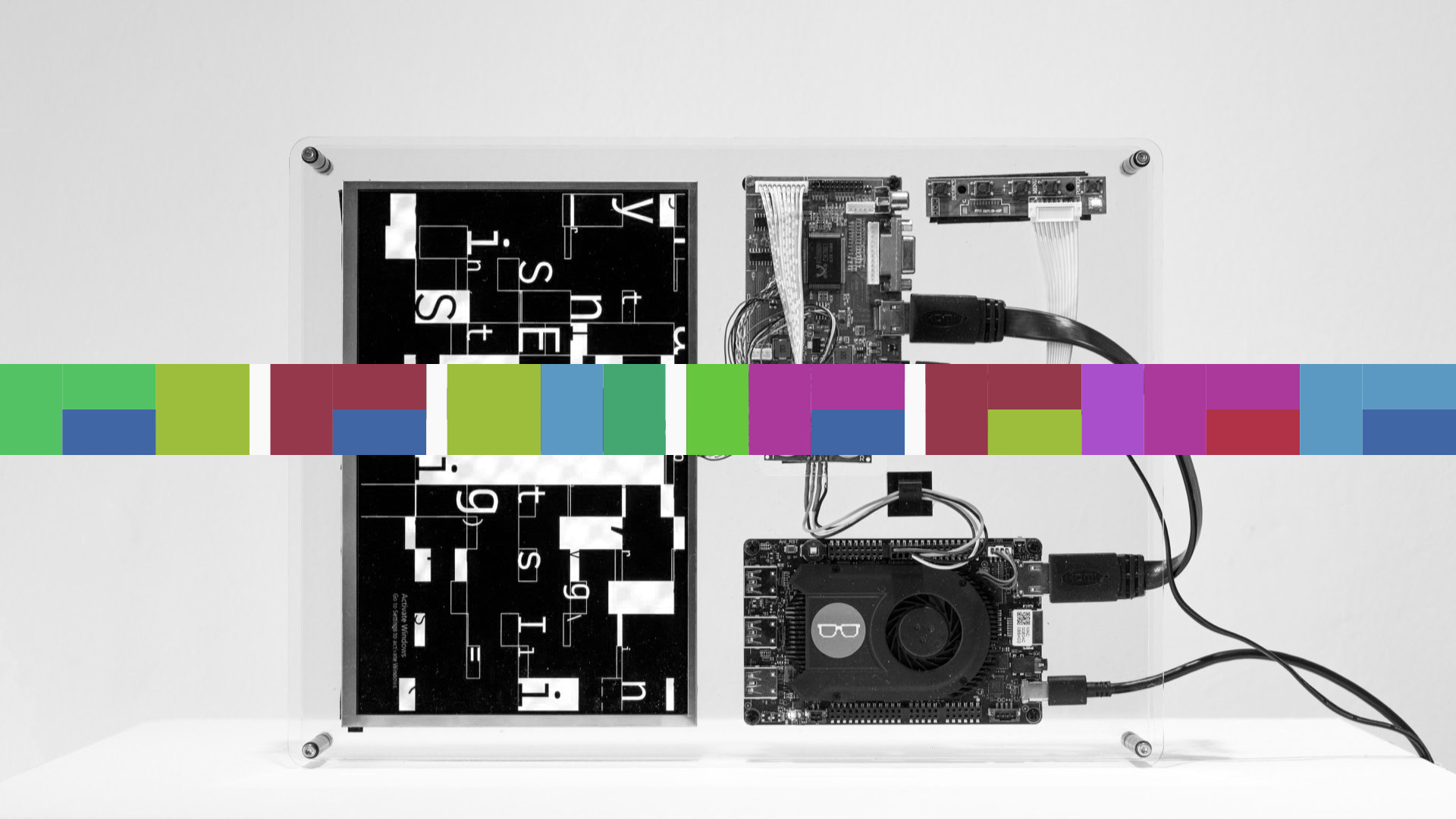
Chromacode is a visual identification system that translates the title of a project into a single horizontal band of colour. Each character in the title is mapped to a bar, arranged from left to right to form a compact, readable signature.
The system treats language as structure rather than text. Vowels and consonants follow different colour rules, while spaces and punctuation create pauses in the sequence. When a vowel follows a consonant, the bar is stacked, encoding the transition between sounds as a layered mark rather than a single tone.
Chromacode is deterministic: the same title will always generate the same colour pattern. While no two titles produce identical results, titles with similar rhythms or structures often share visual qualities. The result is not a logo or illustration, but a repeatable code — a quiet visual fingerprint that can be read, reproduced, and recognised without being explicitly decoded.
Colour Palette Generation
The core colour palette generation turns any alphanumeric string — in this case brendandawes.com into a harmonious, repeatable palette by first hashing the string into a stable seed, then generating colours in HSL space rather than RGB. A base hue is selected and additional colours are distributed around the colour wheel using the golden angle, which creates balance without obvious repetition. Saturation and lightness are gently varied to produce usable contrast, with an optional vivid mode that increases intensity without tipping into garishness. The result is a palette that feels designed rather than random, while remaining entirely deterministic and reproducible.
FAC 73
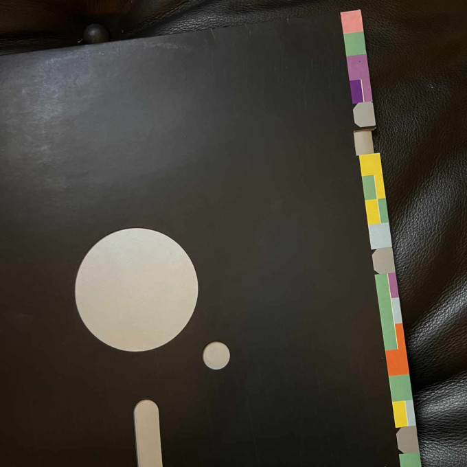
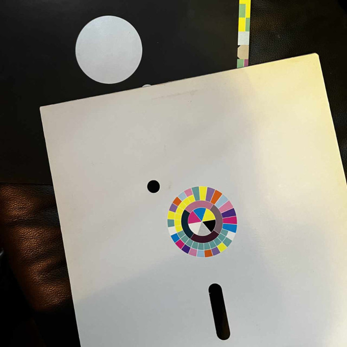
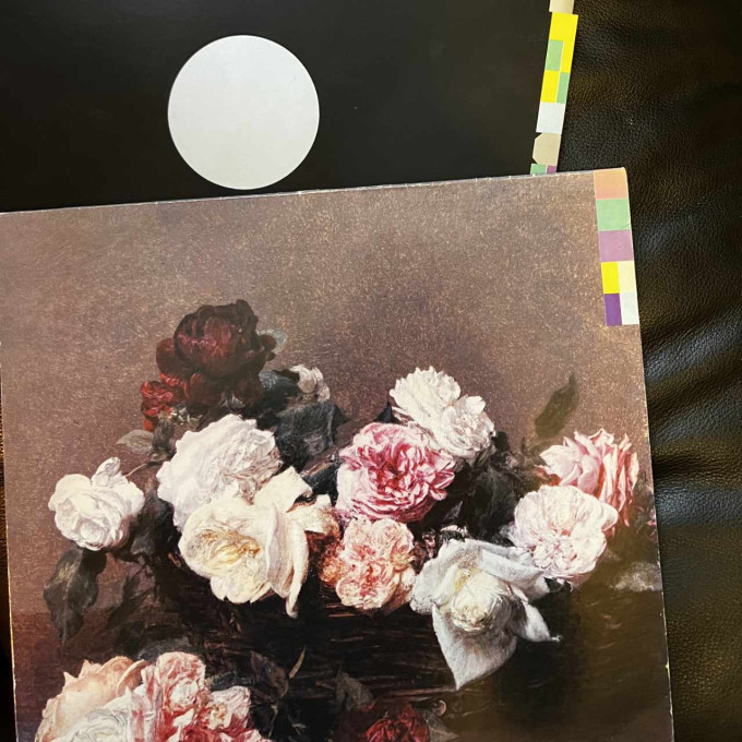
The system is inspired by the iconic cover for New Order's Blue Monday, designed by Peter Saville for Factory Records in 1983. I still remember buying that record at Our Price Records in Liverpool, in the entrance of Central station. At the time I had no idea that the colour system running down the right outer edge was representative of the record release number and the name of the record. Looking back it was not only the first great piece of graphic design I owned but the first data visualisation. The record itself still remains one of my all time favourites.
Below are the original 1983 pressings I own, including FACT75 — Power, Corruption & Lies — both complete with die-cut sleeve, the latter featuring the colour wheel used to create the codes.
This is a great blog post about decoding the cover.